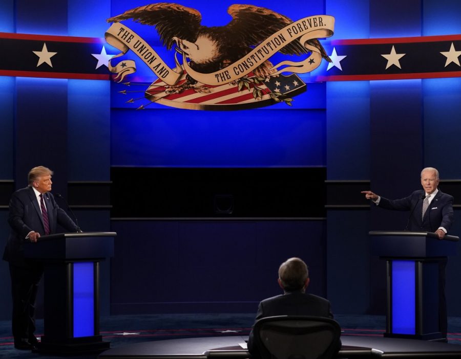
The real debate
Graphic design is everywhere. From walking down an aisle of a grocery store, pondering cereal box logos. To something much more like the logo of a presidential campaign.
According to InteractionDesign.org, “Graphic design is a craft where professionals create visual content to communicate messages. By applying visual hierarchy and page layout techniques, designers use typography and pictures to meet users’ specific needs and focus on the logic of displaying elements in interactive designs, to optimize the user experience.”
But how does a simple advertisement affect an event so large such as the presidential debate? It’s as simple as science! The 45th president, Donald Trump’s logo will be used as the first example.

Whether you love him or hate him, his campaign was significantly successful. The main factor being his logo. His logo is powerful and bold, this is because of the strong typography. The use of navy blue and the 5 stars further reinforces the logo with feelings of patriotism.
As stated by Ebaqdesign, “The Trump’s logo is well executed and makes an impact because of the contrast between the extended bold typeface caps and the condensed typeface caps.”
Junior Emilee Rose said, “I would say trump’s campaign sign has a better graphic design because his is more than just his name. He has a slogan, border, and some small designs that I feel bring the whole thing together. But if I were the designer I would add more of the stars that are in the red border.”
On the opposite side of the spectrum is democratic candidate Joe Biden.
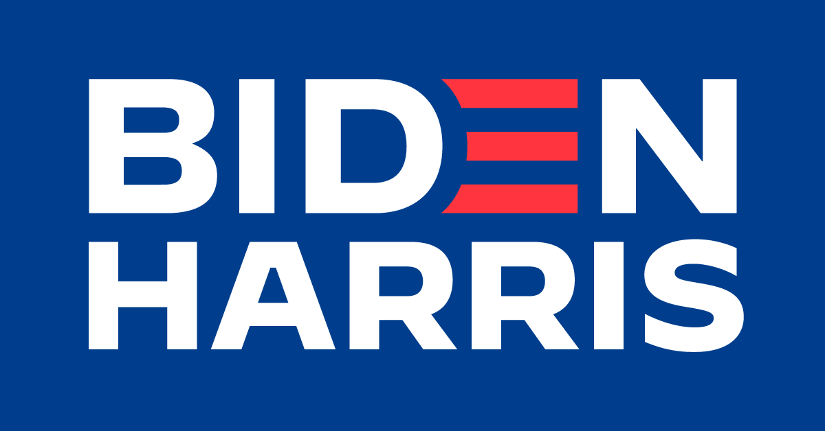
Similarly to Trump, Biden incorporates strong bold, typography symbolising power. The soft white background gives his name all of the spotlight. However there is a main difference between the logos, creativity.
A design as simple as changing the color of one letter spiked popularity. The logo was designed by PR firm Mekanism.
They state, “By incorporating nods to the American flag, this logo is a representation of Biden’s investment in America. The 3 stripes represent the branches of government and the strength of unity with Biden.”
Sophomore Ella Adams said, ” I like how the red E is integrated into the D as three lines, it’s very creative. However if I were to design this logo I would add a line between Biden and Harris. I believe it looks empty without out.”
Well there we have it folks, the real debate this election. Based off the science behind their designs, what do you think? Do you appreciate the traditional patriotic approach? Or do you value creativity in a new approach? Let the ETC team know in the comments below!